Wanna Learn How to Design a Logo? Here are the Things You Should Know
Today, in the classroom of Infuencive Media, we’ll talk about graphic designing, and logo design to be specific.
Logo design is a process that requires expertise. It isn't enough to just have some artistic skills or be good at drawing; you need knowledge for your designs to stand out among the competition and connect with audiences on an emotional level. This article talks about what it takes, as logos are not only judged by their appearance but also how well they resonate within the audience the brand is targeting.
What makes a logo design iconic? To some, the Nike swoosh and McDonald's golden arches are as recognizable today as they were back when each first came onto our screens. The reason for their success is because both logos have one thing in common - an instantly identifiable trait or feature which allows them to stand out from other brands without having any need at all for promotion.
When you're starting a new logo design project, it can be daunting to think of everything that needs consideration. There are so many things involved in creating an effective and memorable symbol for your company. From capturing the brand's character down to how to best communicate its personality. This can be done through design elements such as color choices or shapes used within graphics packaging materials.
There is no one-size-fits-all strategy when designing logos because different companies have varying requirements under which they require specific features. For example, some want futuristic designs while others might prefer a traditional look.
Below is a list of elements you need to take care of when designing an impactful logo that will dictate the design philosophy of the brand.
Do Your Research Beforehand
A logo design should begin with some groundwork. Understanding the client and their product will help you choose a strong direction for your work. This in turn makes it easier to get consensus on anything further down along that same line of thinking when designing logos or other aspects identified by this process.
Having a Sketchpad is a Great Help
There are many tools available today that can be used to create logos. One way is through digital designing, but if you're looking for more creative freedom or just need ideas on what direction the design should go in then sketching out designs with pen and paper will give the best results. This is because there isn't any interface blocking creativity like other programs may do while allowing viewers full access into all aspects of design without having bright lights glare across their screen which helps prevent headaches caused by staring at glowing pixels.
Always Use Neutral Colors in the Beginning
Color can be a distraction when trying to think about the fundamental idea behind your logo. It’s often easier and more engaging if you leave this element until later in the design process, where there's less temptation or pressure from other variables like color schemes already established on paper. It also helps you to better convey the concept to the client.
Relevancy is the Key
Incorporating the right typeface and color palette will help you create a logo design that is both timeless and relevant to your ideas, values, or activities. For example, an elegant serif font like Helvetica works well for high-end restaurants because it symbolizes luxury. Similarly, bright neon colors may not be what's best suited towards children’s nurseries since they're more associated with nightclubs instead of nostalgic sentiment.
Keep this in mind, and you’ll find yourself with more sales. If your designs are appropriate for the client they will be easier to market because people want what is best suited for them- not just anyone can wear clothing designed by a designer who doesn't have any experience or knowledge on how customers think.
The Logo Should Have a Recall Value
A logo is the most important and powerful tool in any brand's arsenal. It should be simple, yet memorable enough to catch someone’s eye at first glance which can't happen if your design has too many details or feels overwhelming at all times.
A good way of achieving this balance? Simplicity! A basic-looking thing often gets remembered longer than something complicated does- so keep that simplicity going throughout every stage during the design process.
Simple Yet Unique
If you want to set your client apart from the competition, you must use different fonts and colors. If every other brand in the industry is using a particular typeface or palette of hues then this could present an opportunity for you to stand out from the rest while appealing at the same time.
Consider Brand Identity When Designing a Logo
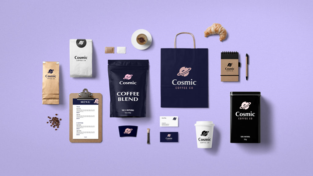
When designing logos, it is important to think of the various ways that your brand may be presented. Your logo should appear in different contexts and on various mockups as this will help you avoid any awkward situations when presenting them together with other designs for example at trade shows or during client meetings.
Is Your Logo too Literal? Don’t Let it Be
Logos don't always need to show what a company does; in fact, it's often better if they do not. More abstract marks are often more enduring and memorable than logos with directly descriptive meanings like " factory" or “family Crest” which can date quickly over time as society changes its associations around those items' original purposes (for example, a coat of arms was originally used by families who ruled certain regions under the medieval rule).
Two Mind Are Better Than One
When you're designing a logo, don't underestimate the value of having an outside perspective. It can be easy to overlook possible cultural misunderstandings or unfortunate shapes that could turn off potential customers from your company's products and services. The best way is by seeking out someone who has a different experience than yours within these areas so their input will give insight into what may have been missed during the initial planning stages.
In the end, we would like to give you a reality check. Not everyone’s going to agree with your design. You being thick-skinned helps a lot. Initial criticism does not determine the longevity or timelessness of your logo. So keep working at it and make sure you don’t compromise on your principles. Happy designing!








.webp)


